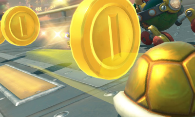
Video games have gained detailed faces, enormous landscapes and lighting effects that would’ve seemed impossible during the arcade era., yet some of their most helpful graphics are still remarkably simple for this day and age. A heart means health, a coin suggests value and a star usually promises something that’s worthwhile collecting. You understand the message before anyone explains the controls, even at a hurried glance for a brand new game.
That visual shorthand grew partly from necessity as early game developers had limited pixels, colours and memory to work with, so every object needed a clear silhouette and an obvious purpose. Modern games have fewer technical restrictions, but the old symbols haven’t disappeared. They’re too good at helping you read a screen while staying on your toes.
Early Games Couldn’t Afford to Have Visual Clutter
An arcade game had mere seconds to attract your attention and convince you that its controls were easy to figure out on the fly. Pac-Man’s pellets formed a route through the maze, while the larger power pellets announced their importance through their size alone. Super Mario Bros. used coins, mushrooms and flashing stars to separate rewards from hazards without stopping the level for a speedy tutorial.
Colour did an equally important job at giving you ideas on what was happening. Red could mark danger, while green often indicated safety or recovery and gold suggested great value. These weren’t fixed laws, but repetition turned them into a shared visual language. Once you’d learnt that a floating heart restored health in one game, you were prepared to test the same assumption elsewhere.
The limitations also encouraged exaggeration. A key couldn’t be drawn as a thin, realistic object because it would vanish against the background. It needed a large ring, a short stem and teeth you could see immediately, while treasure chests had heavy outlines.
Fruit, Stars and Gold Still Read Instantly
Simple imagery continues to work when a screen has several moving parts to the game. The Big Bonus slot uses recognisable fruit-machine symbols across six reels and four rows, with red fruits, plums, lemons, gold stars and wild symbols performing different jobs. Its 50 fixed paylines add information beneath the surface, so familiar pictures help keep the display readable.
The two formats operate differently, and the outcome of a slot comes from chance rather than your reflexes. What they share is the need to communicate quickly. A gold star looks important before you know that three of them can trigger the feature, just as a flashing object in a platform game invites investigation.
The bonus sequence adds another familiar cue by changing the task on screen. You select from marked symbols to reveal a multiplier, after which the game enters its free-spin feature with sticky wilds. Clear counters and altered graphics tell you that the normal state has paused. You don’t have to study the underlying software to recognise that you’ve entered a separate phase.
Good Icons Tell You What You Can Do
Readable graphics don’t merely decorate a game but suggest actions. A door invites you to find a way through it, a cracked wall looks breakable if you run at it with enough force and an empty slot in an inventory hints that another item exists somewhere. Players absorb these clues while moving, which keeps written instructions from interrupting every discovery.
Retro games became particularly good at this because lengthy explanations weren’t practical. The hidden routes in Super Mario World used keys, keyholes, coloured switches and alternate exits to encourage experimentation. You could miss whole sections of the map, although the game supplied enough visual evidence for a curious player to begin looking.
Modern interfaces use the same principle in menus. A cog represents settings, a speaker controls sound and a house returns you home. An original icon may look stylish while still leaving everyone wondering what happens if they press it.
If a star serves as a collectible in one section, using the same star as a close button elsewhere creates unnecessary confusion. Players shouldn’t need to relearn the visual grammar whenever the background changes.
Detail Works Better When the Basics Are Clear
High-resolution artwork gives designers room for texture, expression and atmosphere, but extra detail doesn’t automatically improve communication. A beautifully rendered object can blend into an equally detailed background. Strong silhouettes, controlled colour and contrast still decide whether you notice it in time.
Accessibility makes those choices even more important. Colour alone shouldn’t carry essential information because players can perceive it differently. Shape, placement, labels and sound can reinforce the same message. A red warning icon works harder when it also has a distinct outline and appears in a predictable position.
The best symbols become almost invisible as you stop admiring the icon and respond to what it tells you. Decades of progress haven’t made that clarity obsolete. Games can build grander worlds than early developers ever imagined, but a bright coin, a heart or a well-placed star can still explain the next move faster than a paragraph ever will.

- Yoshi’s Island Bonus Stages and Lucky Spins
- Why Gaming’s Simplest Symbols Never Went Out of Style
- How Early Slot Machines Changed Arcade-Style Game Design
- Pokémon TCG Pocket vs GBA Pokémon: How Collecting Loops Changed in 20 Years
- 4 arcade mechanics that quietly explain how sweepstakes games work today
- Will Gaming Libraries Be The End of Games?
- When the Reels Stop: What Fast Casino Payouts Really Mean in 2026
- Why Catching Pokemon in ROM Hacks Feels Exciting
- Why Pokemon Cloud White’s Random Encounters Hook You
- From Game Gear to Browser Fun
- Why Mario Kart Nights Paired With Comfort Food
- How Fan-Made Pokemon ROM Hacks Build Communities
- The Quiet Math Behind The Minish Cap
- What Can Sweepstakes Casinos Learn From the Design Philosophy of Retro Games?
- From High Scores to Real-Time Predictions: A New Era of Digital Competition
- Game Boy Advance Nostalgia Meets Mobile Play: What Handheld Gaming Taught Us About Playing on the Go
- What the 90s Did For Gaming – A Revolutionary Era
- Why Retro Games Feel Right at Home in a Browser
- From Retro Slots to Browser Games: Why Simple Reward Loops Last
- The worst American football-themed video games ever made
- The Card Games That Taught Computers to Play
- When the Arcade Cabinet Was Part of the Game
- Bonus Stages in Modern Slots Have More in Common With Arcade Games Than You Think
- Hidden Chance Games Inside Classic SNES Titles
- Five Games for When You Just Want to Play
- The Real Market Behind Virtual Retro Goods
- How Clear Navigation Enhances Player Exploration in Digital Casinos
- Why Hardware Limits Made Retro Games Better Designed
- The Impact Of Retro Gaming On Adjacent Entertainment Sectors
- How Pixel Art Became Cool Again
- They All Started With Retro Games But Left the Biggest Impact in Esports
- The Coin-Collecting Thrill of Super Mario World
- How Mario Kart’s Item Box Won Players Over
- When Retro Games Hid Tiny Slot Machines
- Retro Gamers Keep Reviving Classic PlayStation Titles Through Browser Emulation
- Why Fast-Start Design Still Wins in Retro Gaming
- How Old-School Basketball Games Built a New Generation of Fans
- Pokemon Cloud White’s Wild Grass Surprises
- How 80s Arcade Design Powers Modern Games
- How Fearless Draft Is Reshaping Professional League of Legends
- How Super Mario RPG’s Timed Hits Shine
- How to optimize your browser for lag-free retro gaming in 2026
- The Technical Magic Behind Retro Gaming’s Most Massive Worlds
- How Gold Slot Themes Add Familiar Casino Style
- What Actually Happens on the Convention Floor Wi-Fi at a Retro Gaming Expo
- Why Hidden Unlockables Made Games More Memorable
- The Death of Cheat Codes and What Replaced Them
- Why Retro-Themed Slot Games Are Thriving in Ontario’s Licensed iGaming Market
- The Best Retro-Themed Online Slot Games Available Today
- How Arcade Classics Shaped the Design of Modern Online Slot Games