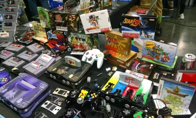
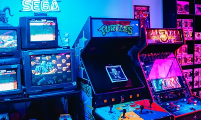
Retro platformers mastered something modern slot lobbies still sometimes struggle with—instant understanding. In classic games, each level clearly signaled its theme, difficulty, and mechanics without text-heavy explanations. A lava world meant danger. An ice world meant sliding physics. Even without instructions, players knew what to expect from visuals and layout alone.

When slots are created effectively, they follow the same structure: the theme matches the tone, the mechanics come across as intuitive and expected, and the layout sets the journey.
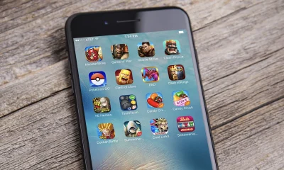
Many of the games themselves manage this well, but today’s lobbies often overload players with flashy art, inconsistent typography, and unclear mechanics labels. To improve clarity, lobby designers can borrow retro level design philosophies to build slot lobbies that feel readable, intuitive, and satisfying.
Slot themes explained through readable visual grammar
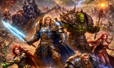
Each slot theme acts like a world, and players rely on visual shorthand to interpret it. An ancient myth slot theme succeeds when it uses appropriate symbols—temples, relics, gods—to signal discovery and bonus potential. A crime or mafia theme, meanwhile, suggests mechanics that might involve making strategic picks or engaging with mission-like features. Retro level design excelled at this kind of thematic consistency. The best slots do the same by pairing iconography with logical mechanics.
However, modern lobbies need to draw similar lessons from this approach. They must offer players a logical layout so that they can find things with ease. An example of this would be clear labeling. The lobby should make it obvious whether a game has certain mechanics or not.
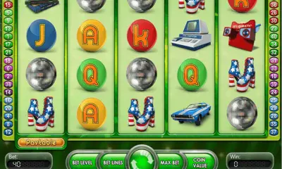
This is where labels like “Hold & Win,” “Megaways,” or “Cluster Pays” come in. The Hold & Win mechanic’s meaning is easy to understand when labeled properly: land special symbols, they lock in place, and respins continue until no new symbols appear.
The issue is that many players never see these labels because tiles are cluttered with too much information. However, when themes and mechanics are both visible at a glance, navigation becomes effortless. This is how retro-level clarity becomes a framework for modern lobby design.
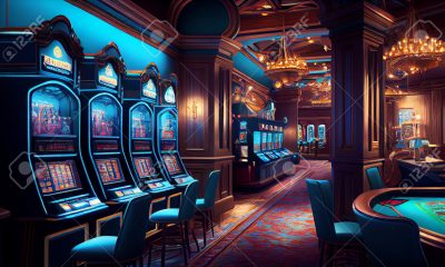
Why jackpot lobbies need consistency, grouping, and hierarchy
It’s not just the labels that matter either; how the games are ordered needs to feel intuitive to the player. Even if labeling makes it clear what mechanics each game will feature, players will still get frustrated if all the Hold & Win titles are scattered around the lobby at random and they need to search through everything to find the ones they want.
This is another area where casinos can take inspiration from retro games. Early game designers not only faced the challenge of building interfaces that were easy to use with the limited hardware of the day, but also of making everything feel intuitive. A lot of these games were designed for a far less tech-savvy audience, and the developers needed to consider the prospect that their interface might be one of the first digital menus a player had encountered. As such, many retro games have menus and interfaces that are designed to help even a beginner grasp the concepts quickly.
Clear grouping is a good place to start with this. Laying titles out alphabetically might feel like a simple approach, but for anyone interested in a specific kind of game, for instance, progressive jackpots, this will likely prove frustrating. Instead, a good casino lobby should provide a dedicated Progressive Jackpot Slot page so that anyone looking to play this kind of game specifically can browse their options without having to skip past unrelated titles.
Of course, even if it is easy to filter the games by specific mechanics, it’s still important to provide the player with clear information on how each mechanic works. In retro games, this was usually done by introducing the mechanics to the player, one at a time, as the game progressed, letting them get familiar with the idea before introducing some new concept.
Modern casinos take cues from this. While there are some games that feature multiple mechanics, such as a progressive jackpot and hold & win, you will find many others that stick to just a single central mechanic, helping players get used to this concept before moving on to something more complex.
Themes are another area that needs to be carefully considered and signposted for user convenience. A helpful checklist when evaluating theme tiles includes:
- Can the theme be identified in one second?
- Do the symbols in the game match the theme well?
- Are fonts, colors, and spacing consistent?
If you want to get an idea of what this looks like, checking out this video that covers a multitude of slot themes across different eras is a great place to start:
“The Slot Father: Book of Wins (Hold & Win)” pairs genre and mechanic in the title. “Ancient Aztec Bonanza” uses strong cultural iconography with familiar bonus expectations. “Primal Hunt” uses bold silhouettes and clean type. These examples show how clear theme identity plus concise mechanic labels create slots that feel like “levels”—easy to preview and easy to choose from.
Why theme affects player decisions more than visuals alone
The theme of a game isn’t just about decoration—it shapes expectations in the same way that retro levels did when they chose an environment such as ice or fire. Ancient myth slot themes often imply feature-driven exploration or bonus discovery. Light-hearted cartoon themes hint at faster play and frequent small wins. Crime themes might suggest pick-and-choose mechanics.
When themes align with mechanics, players build mental templates and navigate faster. When art and behavior don’t match, confusion increases.
Practical design rules for future-ready lobbies
To build lobbies that feel intuitive:
- Use consistent iconography for each theme category.
- Keep mechanic labels short and direct.
- Maintain readable typography and strong color contrast.
- Include micro-interactions that reveal mechanic summaries.
- Group tiles by mechanic or theme, not randomness.
Technical standards help ensure features are clearly identified, but UX design is what makes them usable. The best lobbies blend both.